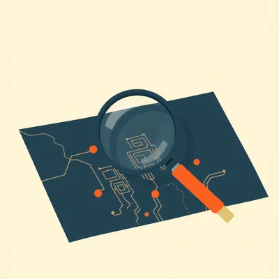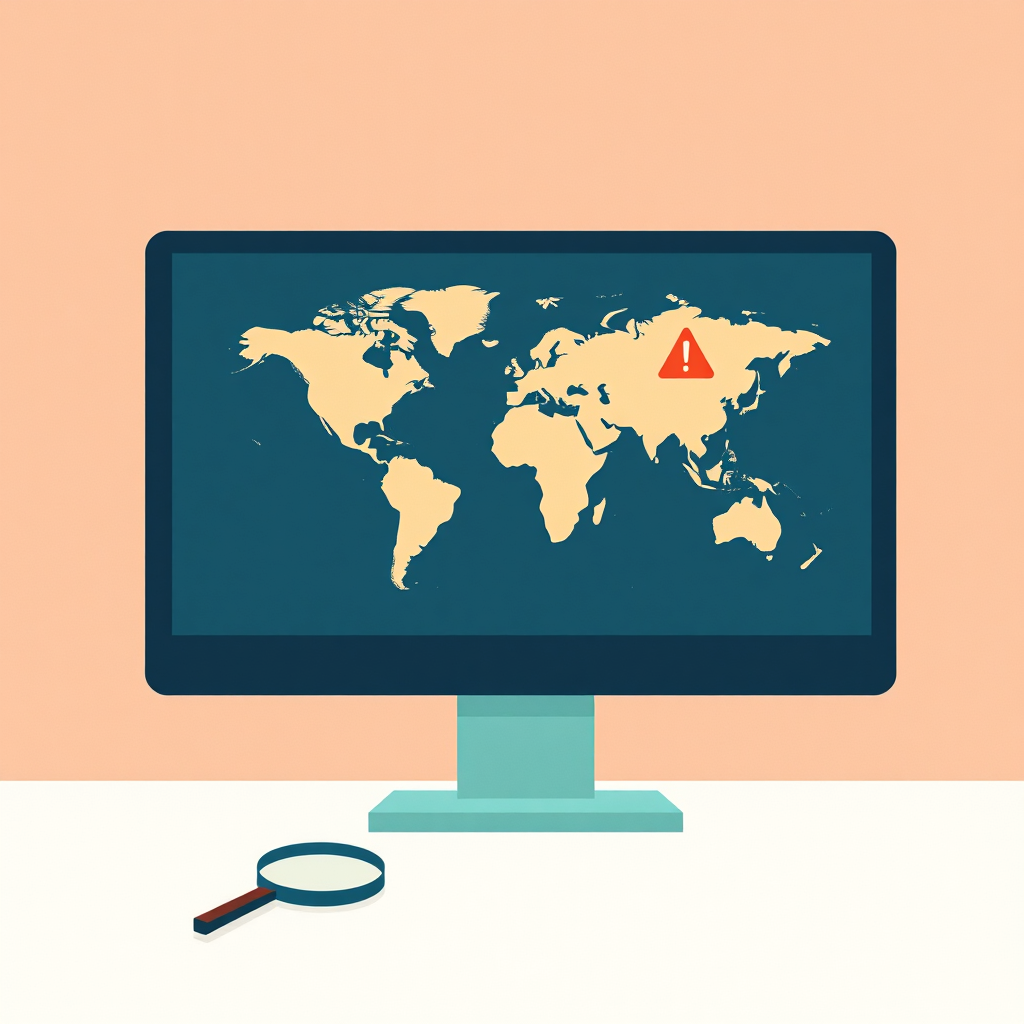
You know, Herman, I was looking over at Daniel’s desk late last night and he had this glowing multi-monitor setup with all these pulsing maps, scrolling terminal feeds, and heat maps. It honestly looked like he was running a small, private intelligence agency right from our living room in Jerusalem. It turns out he’s been iterating on this situational awareness dashboard project again, and this time, it looks serious.
Herman Poppleberry at your service. Yeah, I saw that too. He’s actually got a really clean setup this time, much better than the version he had six months ago. Today’s prompt from Daniel is about the fundamental challenge of building these situational awareness tools, specifically focusing on geopolitical intelligence data feeds. He’s looking at the massive gap between the high-end enterprise tools used by governments or hedge funds and what a home hacker or a small business owner can actually afford and implement in February of twenty twenty-six.
It’s a fascinating problem because, as Daniel pointed out in his notes, we’ve talked about productivity dashboards before. You know the ones, they show your calendar, your Trello board, maybe the local weather and your step count. But situational awareness is a completely different beast. It’s not about what you have to do today. It’s about what the world is doing to you, or around you, in real time. It’s about the OODA loop, observe, orient, decide, and act.
Exactly. The stakes are significantly higher and the data is much, much messier. When you’re building a personal productivity dashboard, the signal-to-noise ratio is usually pretty good because it’s your own data. You know what your meetings are. But when you start pulling in geopolitical feeds, you’re suddenly trying to filter the entire planet’s worth of chaos through a single screen. If you don't have a plan, you just end up with a digital version of a panic attack.
And that’s where the noise becomes a real barrier to entry. Daniel mentioned that he’s been using large language models, specifically Gemini and some local Llama instances, to summarize news stories by keyword to avoid that classic RSS feed fatigue. I think that’s a brilliant starting point. If you’ve ever tried to follow a major event, like the recent tensions in the South China Sea or the ongoing shifts in Eastern Europe, through standard news feeds, you just get a hundred versions of the same story from different outlets. It clogs up the dashboard and makes you miss the actual updates.
It’s the echo chamber effect. AI is the perfect filter there because it can perform deduplication at scale. But the real meat of his prompt is about the specialized data feeds. He mentioned ACLED, which is the Armed Conflict Location and Event Data Project, and GDELT, the Global Database of Events, Language, and Tone. These are the tools that professional analysts use to map out where things are actually happening on the ground. These aren't just news sites; they are structured databases of human conflict.
Let’s start with the big picture stuff. If you’re a government control center, a massive multinational corporation, or a high-frequency trading firm, you aren't just looking at a fancy RSS reader. What are the professionals actually using in twenty twenty-six? You mentioned Dataminer earlier.
Dataminer is still the gold standard for real-time alerts, though they have some stiff competition now from companies like FalconFeeds and Janes. Dataminer uses incredibly sophisticated artificial intelligence to scan billions of public data points every hour. We’re talking social media posts, sensor data, maritime transponders, and even obscure local radio feeds. The goal is to detect a crisis before it even hits the wires. If there’s an explosion in a city or a sudden, unannounced border movement, Dataminer is often the first to flag it, sometimes ten to fifteen minutes before a major news outlet like Reuters even sends a push notification.
Ten minutes feels like an eternity in a crisis. But the catch, as Daniel suspected, is the cost. What are we looking at for a seat at that table?
We’re talking tens of thousands of dollars per year, per user. It’s built for newsrooms, hedge funds, and government agencies. For a home hacker or a small business with five employees, that’s a non-starter. So the question becomes, what does that twenty thousand dollar subscription give them that we can’t get? Is it just the speed of the AI filtering, or is it something deeper?
It’s the speed, but it’s also the breadth of the sources. These high-end tools have access to data pipes that aren't public. They’re also doing very sophisticated sentiment analysis and geolocation. If ten people in a specific neighborhood in a foreign city tweet about a loud bang or a power outage, the system can triangulate that into a verified event long before a journalist arrives on the scene. It’s about turning raw noise into a structured, actionable alert.
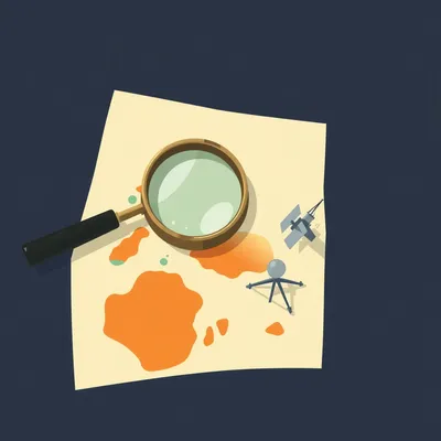
Right. So if we can’t afford the twenty thousand dollar a year subscription, we look at things like GDELT. I’ve looked into GDELT before, and Corn, it feels like trying to drink from a firehose that’s connected to a waterfall. For those who don't know, GDELT is a massive open data project supported by Google Cloud that monitors world news in over a hundred languages. It’s constantly updating a database of everything that happens, everywhere. But how do you actually make that useful on a dashboard without losing your mind?
That is the million-dollar question. GDELT is incredible because it’s free and it’s arguably the most comprehensive record of human activity ever created. It tracks people, locations, organizations, and even the "tone" of the coverage on a scale of negative ten to positive ten. But it is incredibly noisy. If you just plug a raw GDELT feed into a dashboard, you’ll see thousands of tiny, irrelevant events every hour. To make it work for a situational awareness setup, you have to be very good at SQL or use a tool like BigQuery to filter for specific regions or event types.
So it’s a data science project, not just a widget you drag and drop onto a screen. You have to write a query that says, "Show me only events in the Levant region that involve military movement or civil unrest with a tone score below negative five." Even then, you’re going to get false positives. It requires a lot of tuning. It’s like being a radio operator in the nineteen forties, trying to find a specific frequency amidst all the static.
What about ACLED? Daniel mentioned that one too. From what I understand, they’re a bit more curated than GDELT.
ACLED is fantastic for a different reason. While GDELT is largely automated and pulls from news, ACLED is a disaggregated data collection. They have actual researchers who verify and code individual events of political violence and protest. It’s much higher quality data because there’s a human element in the verification process. If you want to see a map of where conflicts are actually shifting, ACLED is the place to go. They categorize events into things like "Battles," "Explosions/Remote Violence," and "Protests."
But is that real-time? If a researcher has to verify it, aren't we looking at a significant delay?
There is a delay, and that’s the trade-off. ACLED is usually updated on a weekly basis, though they’ve been pushing for more frequent updates in high-conflict areas like Ukraine or the Middle East. So it’s not a tactical, "this is happening right this second" feed. It’s a strategic feed. It helps you see the patterns. For a situational awareness dashboard, you might use a custom AI news filter for the "right now" events, and then use ACLED to provide the underlying trends and context.
That makes sense. It’s about layering the information. You want the tactical alerts for immediate safety or business decisions, but you need the strategic layer to understand the context. Daniel’s setup here in Jerusalem is a great example. He’s got the Rocket Alert feeds from the Home Front Command, which are as tactical as it gets. Those are binary, either there’s an alert or there isn't. But then he’s got these news summaries to explain why things might be escalating.
And that’s where he’s using the latest LLMs to bridge the gap. He mentioned summarizing top stories by keyword. This is actually a huge step forward for home hackers in twenty twenty-six. Previously, you would have to write complex scrapers and regular expressions to filter news. Now, you can just feed a bunch of headlines into an API and say, "Give me a three-sentence summary of the latest developments regarding the Red Sea shipping lanes, and highlight any mention of new drone technology." It cuts through the repetitive reporting and gives you the "so what" of the situation.
I think one of the biggest challenges Daniel is facing, and anyone building these is facing, is the UI and UX of stress. If you build a dashboard that is too busy, it actually decreases your situational awareness because you get overwhelmed. You stop looking at it, or you miss the one important update because it’s buried under ten minor ones. It’s the "dashboard fatigue" problem.
That’s a great point. Professional control centers often have dedicated walls for different types of data. At home, you might only have one or two monitors. You have to be ruthless about what makes the cut. I actually think the best situational awareness dashboards are mostly empty until something happens.
Right, like the "dark cockpit" philosophy in aviation. You only want to see a light when something needs your attention. If everything is green, the screen should be quiet. But in geopolitics, especially in twenty twenty-six, nothing is ever truly green. There’s always a baseline of noise.
So you have to define what constitutes a deviation from that baseline. This is where those data feeds become interesting. If ACLED shows a sudden fifty percent increase in protest activity in a region where you have interests, that should trigger a change on your dashboard. It shouldn't just be a scrolling list. Maybe the background color of a specific widget changes from gray to amber. You need visual hierarchy.
Let’s talk about the more accessible tools for a second. Daniel mentioned Iran Update dot org, which is run by the Institute for the Study of War. There are a lot of these niche, highly specialized intelligence blogs and sites that provide incredibly deep analysis for free or a small subscription. How do you integrate those into a dashboard without just having a giant wall of text?
That’s where the AI summarization really shines. You can have a script that checks for the latest update from a site like ISW, pulls the text, and then uses an LLM to extract the three most important changes since yesterday. You could even have it compare the new update to the old one to highlight what’s actually new. That turns a thirty-minute read into a ten-second glance. It’s about "delta" reporting, only showing the change in the situation.
I also want to touch on the idea of signal-to-noise ratio in terms of sources. Daniel mentioned he’s using Reuters and I-twenty-four news. Those are solid, but if you’re looking for situational awareness, sometimes you want the raw data. Have you looked into how people are using Telegram or social media feeds in these dashboards lately?
Telegram is the frontline of geopolitical information right now, especially in Eastern Europe and the Middle East. But talk about a firehose. It’s ninety percent noise, propaganda, and unverified rumors. To use Telegram on a dashboard, you really need a sophisticated filtering layer. There are some open-source tools like "Telegram-OSINT" that can bridge Telegram to a more structured format, but you still have the problem of verification.
This brings us back to why companies like Dataminer are so expensive. They are doing that verification and filtering for you. They’re taking the risk of being wrong so you don't have to. For a home hacker, you’re the analyst. You have to decide if that video on Telegram is real or from three years ago.
And that can be dangerous. If you’re making real-world decisions based on your dashboard, you need to know the pedigree of your data. This is why I always suggest that people building these at home include a confidence score or at least a clear source label. If it’s coming from Reuters, it’s one thing. If it’s coming from a random Telegram channel with three hundred followers, it’s another. You have to weigh the information accordingly.
So, if we were to give Daniel a roadmap for his next iteration, what would it look like? He’s got the news summaries, he’s got the local alerts. How does he get to that next level of geopolitical intelligence without spending ten thousand dollars?
I think the next step is moving from text to data visualization. He should look at the GDELT project’s visual tools first. They have some pre-built maps and trend charts that you can actually embed as widgets. Instead of reading about protests, you see a heat map. That’s much faster for the brain to process. The human brain is evolved to spot patterns in images much faster than patterns in text.
And what about the ACLED API? Is that something a regular person can get?
ACLED does have an API. They offer different tiers, and they actually have a very generous program for researchers and non-profits. For an individual, you can often get access to the data for personal use or at a lower cost than a full corporate license. Integrating that would allow him to see those verified conflict events on a map alongside his real-time news feeds. Imagine a map where a blue dot is a news story and a red dot is a verified ACLED conflict event. When they overlap, you know something is real.
I’d also suggest he looks into some of the open-source intelligence, or OSINT, communities. There are people who build specialized feeds for things like flight tracking or maritime data. If you’re worried about regional stability, seeing a sudden surge in military transport flights is a huge signal. Tools like FlightRadar-twenty-four or ADS-B Exchange have APIs that are relatively affordable for hobbyists.
Oh, that’s a great one. Imagine a dashboard where you have your news summary on the left, and on the right, you have a small map showing any unusual military transponder activity in the region. That’s a multi-modal signal. If the news says tensions are rising and the flight data shows ten cargo planes landing at a nearby base, you have a much higher confidence that something is happening. This is what the pros call "all-source intelligence."
It’s about synthesis. The professional tools do the synthesis for you. The hacker has to build the synthesizer. And honestly, building it is half the fun, but it’s also how you learn to understand the data. When you have to write the logic that says, "Ignore this but alert me on that," you’re actually training your own brain to be a better analyst. You’re learning the geography, the players, and the typical patterns of behavior.
Exactly. You’re building a mental model of the world. One thing I’ve noticed with these dashboards is that they often fail because they try to be too global. Daniel mentioned he wouldn't care about a crisis in Chicago if he’s in Jerusalem. That’s a key insight. A good situational awareness dashboard should be hyper-local and then expand in concentric circles of relevance.
Right. If it’s within five miles, I want to know everything. If it’s within fifty miles, I want to know major events. If it’s on the other side of the world, I only want to know if it’s going to affect the price of oil, the stability of my internet connection, or the global supply chain.
And you can actually program those filters. You can use geofencing in your data queries. GDELT and ACLED both allow you to filter by latitude and longitude. So you can create a literal bubble around your location. Anything outside that bubble gets summarized into a tiny footnote. Anything inside that bubble gets a big red flashing light.
What about the hardware side? Daniel is using screens on his desk, but I’ve seen some people using things like e-ink displays for this. They’re less distracting and they can stay on all the time without using much power.
E-ink is great for the strategic layer. You could have a beautiful, large e-ink display on the wall that shows the ACLED conflict map for the week or a summary of the top three geopolitical trends. It doesn't need to refresh every second, so it’s not a glowing distraction. Then you keep your tactical alerts on your phone or a small dedicated OLED screen that only lights up when there’s an emergency. It’s about managing your cognitive load.
I like that. It separates the long-term awareness from the immediate response. I think a lot of people get into trouble because they treat everything like an immediate response. That’s how you get burnout. You can’t live your life in a state of high alert for geopolitical events that might take months to play out. You need a system that respects your peace of mind.
That’s the psychological trap of situational awareness. It’s easy to cross the line from being informed to being "doom-scrolling." A well-designed dashboard should actually prevent doom-scrolling by giving you the answer you need so you can go back to your day. You look at it, you see that the indicators are within normal ranges, and you move on. It’s a tool for peace of mind, not a tool for anxiety.
Let’s talk about the small business angle for a second. If you’re a small logistics company or you have employees traveling abroad, how do you do this on a budget? You can’t hire a full-time security team or pay for a Dataminer enterprise license.
For a small business, I would look at a combination of a few tools. First, I’d use a service like Feedly or Inoreader with their AI features. They have built-in tools now that can filter for business risks like strikes, natural disasters, or political unrest. It’s much cheaper than Dataminer but much more powerful than a raw RSS feed. You can set up "Leo" or their other AI assistants to look specifically for "supply chain disruptions in Southeast Asia."
And then maybe add a custom map?
Yeah, you can use something like Google My Maps or even a simple Leaflet-based web app to plot the locations of your assets or people. Then you overlay the ACLED or GDELT data. If a red dot appears near one of your employees, the system sends you an automated alert via Slack or email. You don't even need to look at the dashboard; it pushes the information to you when it matters.
That’s the ultimate goal, isn't it? The dashboard is just the visual representation of a system that is working in the background. If the system is good, you shouldn't have to look at the dashboard very often. It’s like a smoke detector. You don't stare at the smoke detector all day, but you’re glad it’s there.
Exactly. The dashboard is for when you have that nagging feeling that something is wrong and you want to verify it. Or for your morning briefing. You sit down with your coffee, you look at the screen for two minutes, you understand the state of the world as it relates to you, and then you start your work. It gives you a sense of control in an uncontrollable world.
I think we should also mention the importance of historical context. One of the things that makes professional analysts so good is they remember what happened last time. GDELT is incredible for this because you can look at trends over years. You can see if the current unrest in a particular country is actually worse than the seasonal norm or if it’s just getting more news coverage because of a slow news cycle elsewhere.
That is so important. Media cycles are often disconnected from reality. A story might get a lot of traction because it’s a slow news day, not because it’s a major escalation. By looking at the data, you can see if the actual number of events is increasing or if it’s just the volume of the reporting. GDELT has a metric called "Volume Intensity" that helps you distinguish between the two.
This is where Daniel’s idea of using AI to summarize could be expanded. You could ask the AI, "How does the current volume of reporting on this topic compare to the average over the last three years?" That would give you a massive signal as to whether this is a genuine outlier or just business as usual.
You could even do that with sentiment. Is the tone of the coverage becoming more aggressive? GDELT tracks that. If the tone suddenly drops from a negative two to a negative eight, that’s a leading indicator that something might be about to break. It’s the "vibe check" for the entire planet.
It’s amazing how much of this is now possible for a dedicated individual. Ten years ago, you really did need a government budget to do this kind of sentiment analysis and global event mapping. Now, with a bit of Python, some API keys, and a decent LLM, you can build a version of it in a weekend.
It’s the democratization of intelligence. But with that comes the responsibility of being your own filter. You have to be aware of your own biases. If you only pull feeds that confirm your fears, your dashboard will always look like the world is ending. You have to intentionally include "counter-signals."
That’s why I liked Daniel’s choice of sources. He’s got a mix of government feeds, international news like Reuters, and local outlets. You need that diversity to get a clear picture. If you only look at one side, you’re just building a digital echo chamber with a map. You’re not getting situational awareness; you’re getting situational reinforcement.
And that’s the opposite of situational awareness. That’s just reinforced delusion. To truly be aware, you have to be willing to see things you don't want to see. You have to look for the data that proves your current theory wrong.
So, for our listeners who are thinking about building their own, what’s the first step? Don't start with the code, right?
Start with the questions. What do you actually need to know? What events would actually change your behavior? If a coup in a country you’ve never heard of doesn't affect your life, your family, or your business, don't put it on your dashboard. Be ruthless about your geographic and thematic scope. Start with a circle around your home, then your city, then your country.
Once you have the questions, then you find the data. Maybe start with a curated news aggregator like Feedly and an AI summary tool. That’s the lowest barrier to entry. Then, as you get comfortable, start looking at GDELT or ACLED for that deeper data layer. And don't forget the local stuff. Sometimes the most important situational awareness comes from the most mundane sources.
Local police scanners, transit alerts, weather stations, even local community groups. Those affect your day-to-day life more than a border skirmish three thousand miles away. A good dashboard balances the mundane with the momentous.
It’s the combination of the two. A good dashboard shows you that there’s a major traffic jam on your way to work and that there’s a major geopolitical shift happening. Both are part of your situation. One affects your next hour; the other might affect your next year.
I think Daniel’s project is a great example of this. He’s combining the Home Front Command alerts with global news. It’s a very Jerusalem-centric setup, but the principle applies anywhere. You have to know when to run to the bomb shelter and when to just buy extra groceries because a supply chain might be disrupted. It’s about practical preparedness.
It’s funny, we started this talking about glowing screens and intelligence agencies, but it really comes down to basic preparedness. These tools just give us a better window into the world so we can make better decisions. It’s about reducing uncertainty.
And that’s what we’ve always tried to do on this show. Explore the weird ways technology can help us navigate a complicated world. Daniel’s prompt really hit on a topic that is becoming more relevant every day as the world feels more volatile. We’re moving from the era of "information abundance" to the era of "information synthesis."
It really does. And hey, if you’re listening and you’ve built your own situational awareness setup, we’d love to hear about it. What sources are you using? How are you filtering the noise? Are you using any specific LLM prompts that work well for summarization? You can reach us at show at myweirdprompts dot com.
Yeah, and if you’re finding value in these deep dives, please consider leaving us a review on your podcast app. Whether it’s Spotify or Apple Podcasts, those ratings really help us reach more people who are interested in this kind of human-AI collaboration. We’ve been seeing some great feedback lately on the technical episodes.
It genuinely helps. We’ve seen some great growth lately and it’s all thanks to you guys spreading the word. We’ve been doing this for over six hundred episodes now, and the community around the show is just incredible. We’ve got people from all over the world sharing their prompts and their setups.
It really is. We’re coming up on seven hundred soon, which is wild to think about. We’ve covered everything from personal productivity to now, global intelligence. It’s been a wild ride.
And we’re just getting started. There’s so much more to explore, especially with how fast AI is changing the landscape of what we can build at home. By the time we hit episode seven hundred, the tools we talked about today will probably be even more powerful.
I’m already looking forward to Daniel’s next prompt. I wonder what he’ll add to the dashboard next. Maybe some automated satellite imagery analysis? There are some interesting APIs for that now, like Sentinel Hub.
Don't give him ideas, Herman! He’ll never leave his desk. He’ll be trying to count tanks from space by next Tuesday. Actually, that would be a fascinating topic for another time. The availability of low-cost satellite data for OSINT.
Oh, don't get me started on Sentinel-two data and change detection algorithms. We could do a whole hour on just that. The ability to see a new construction site or a cleared forest from your living room is mind-blowing.
We’ll save that for episode seven hundred. Anyway, this has been a great discussion. I hope it gave some of you the itch to go out and build your own window into the world. Just remember to keep the noise down and the signal up.
Well said. You can find all our past episodes and a contact form at myweirdprompts dot com. We’re on all the major podcast platforms, and we have an RSS feed for the old-school subscribers out there who still like their data raw.
Thanks for joining us in Jerusalem. This has been My Weird Prompts.
Stay aware out there. We’ll talk to you next time.
Goodbye everyone.
Goodbye.
")