You know Herman, I was looking out over the city this morning, watching the sunrise over the Old City walls, and I couldn't help but think about how many layers of history and overlapping interests are packed into just this one square mile. It is like a physical manifestation of a complex network. You have the Armenian Quarter, the Jewish Quarter, the Muslim and Christian Quarters, all physically touching, all with their own internal logic, but completely inseparable from the whole.
It really is. Jerusalem is basically the ultimate high-density node in the global geopolitical graph. If you look at it through a topological lens, it is a place where the "edges"—the connections between cultures, religions, and states—are so short and so numerous that the heat generated by the friction is constant. And that ties in perfectly with the prompt our housemate Daniel sent over this morning. He is thinking about how we can move beyond traditional, flat ways of mapping these relationships.
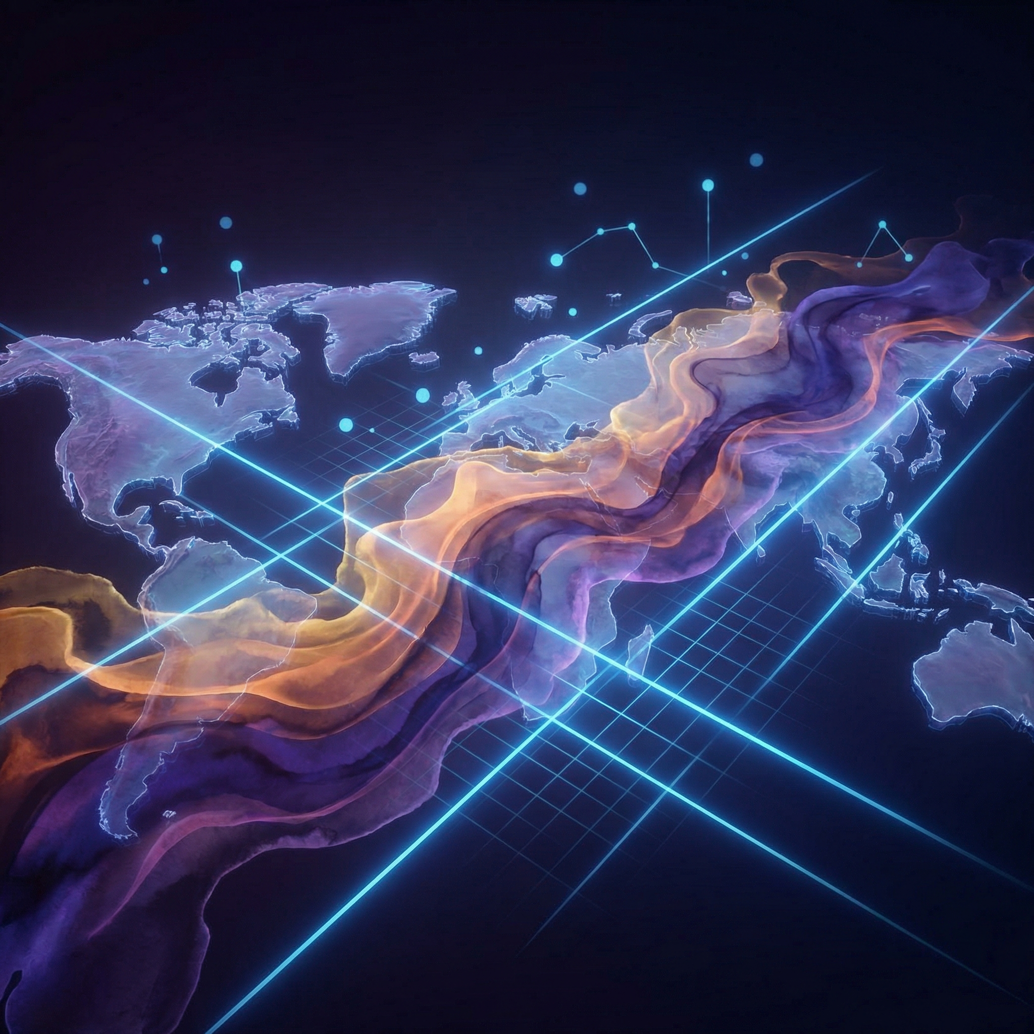
Right, Daniel was asking about using graph databases and artificial intelligence to analyze geopolitics. Instead of just looking at a spreadsheet of countries and their gross domestic product, he wants to see the world as nodes and edges. It is a fascinating concept because it mirrors how the world actually works—not as a list, but as a web. A list is static. A web is reactive.
Exactly. And before we dive into the deep end of the pool, I should probably introduce myself for anyone joining us. I am Herman Poppleberry, and I have been waiting for someone to ask about graph theory in international relations for about three years now. My background is in data architecture, but my heart is in the hidden connections that make the world spin.
I knew you would be excited. You have that look in your eye that usually precedes a twenty-minute lecture on data structures. But let’s keep it conversational. What Daniel is proposing is a shift away from relational databases—you know, the traditional rows and columns of an Excel sheet or a SQL database—toward something that can handle the sheer messiness of human and state interaction.
Precisely. In a traditional relational database, data is stored in tables. If you want to see how two things are connected, you often have to perform these very heavy, computationally expensive operations called joins. You are essentially asking the computer to look at Table A, find a key, go to Table B, find the matching key, and then tell you the result. When you have millions of data points, those joins become a nightmare. But in a graph database, the relationship itself is a first-class citizen. It is stored right there with the data. If Country A has a trade treaty with Country B, that connection, or edge, is as important as the countries themselves, which we call nodes.
So, instead of asking a computer to search through a massive list to find a connection, the connection is already the bridge between the data points. That makes sense for something as fluid as geopolitics. But Daniel mentioned something specific: using vectors and artificial intelligence to find second-order effects. That seems like the real "aha" moment here. It is not just about drawing lines between dots; it is about the mathematical "weight" of those lines.
It is. Think about how we currently measure influence. We might look at military spending or trade volume. But what if we used vector embeddings? In machine learning, a vector is basically a mathematical representation of a concept in a multi-dimensional space. We could represent a country not just by its name, but by a vector that includes its United Nations voting history, its proximity to shipping lanes, its energy dependencies, and even the sentiment of its diplomatic cables. Imagine a space with a thousand dimensions. Each dimension is a different metric—human rights records, lithium reserves, frequency of state visits. A country’s "location" in that thousand-dimensional space tells you more about its true nature than any map ever could.
And once you have those vectors, you can see which countries "cluster" together in ways that aren't obvious on a map. You might find that two countries on opposite sides of the globe have almost identical interests because their vectors are pointing in the same direction. It is like finding your "geopolitical twin" based on behavior rather than geography.
Right. And that is where the graph part gets powerful. Imagine you have this massive graph of the world. Each country is a node. The edges are things like shared borders, trade agreements, or even adversarial relationships. Now, you layer on the artificial intelligence to look for patterns. Most people see the first-order effect: Country A raises tariffs on Country B. That is easy. That is a headline. But the graph shows you the second-order effect. Maybe Country B is the primary supplier of a specific precursor chemical to Country C, which is a key ally of Country A.
So, by trying to hurt Country B, Country A inadvertently chokes the supply chain of its own ally, Country C. That is exactly the kind of insight that often gets lost in traditional analysis because humans struggle to track those tertiary connections across different domains like trade, diplomacy, and military logistics all at once. We tend to think in silos. The trade department looks at trade, the defense department looks at weapons, and the state department looks at treaties. But the graph doesn't care about departments. It sees the whole nervous system.
Exactly. And Daniel brought up a great point about United Nations voting histories. That is a goldmine of data. If you treat every United Nations General Assembly vote as a data point, you can calculate the "cosine similarity" between nations. If Country X and Country Y vote together ninety-five percent of the time, their connection in the graph is incredibly strong, regardless of what their official diplomatic rhetoric says. We saw this clearly in the votes over the last two years regarding the conflicts in Eastern Europe and the Middle East. You see these voting blocs emerge that don't always align with traditional Cold War boundaries.
It is like a "truth serum" for international relations. You can say you are non-aligned, but the graph shows you are actually orbiting a specific power center. I am curious, though, how would a government actually use this? If you are a policymaker in a place like the United States or even here in Israel, how does this change your daily work? Is it just a fancy map, or is it a decision-making tool?
It changes the "what if" scenarios. Currently, if a diplomat wants to understand the impact of a new policy, they might commission a report from a dozen different regional experts. That takes weeks, and the experts might not be talking to each other. With a programmatic construct of the geopolitical landscape, you could run a simulation. You could "perturb" the graph. You say, "What if the diplomatic mission in this specific capital closes?" or "What if this specific strait in the South China Sea is blocked?" The AI can then trace the ripple effects through the network. It might show that closing that mission severs a key back-channel that was keeping a regional conflict from boiling over. It is about predictive resilience.
It is almost like a digital twin of the world’s political state. We talk about digital twins for jet engines or smart cities, but this is a digital twin of global stability. But to make that work, the data has to be incredibly granular. Daniel mentioned trade indicators, exports, and imports. That data is already out there, but it is often siloed in different international organizations. Bringing it all into one graph environment seems like a massive engineering challenge.
It is, but we are seeing the tools catch up. Systems like Neo four j or specialized vector databases like Pinecone or Milvus are becoming much more efficient at handling billions of relationships. The real trick is the "weighting" of the edges. Not all relationships are equal. A shared border is a permanent edge. A temporary trade agreement is a weighted edge that might decay over time. You have to account for the "half-life" of a diplomatic promise.
That is a fascinating point—the temporal element. Geopolitics isn't a static map; it is a moving, breathing thing. You’d need a graph that can evolve. If a coup happens in a country, its node doesn't disappear, but its vector changes radically and instantly. All the edges connected to it might suddenly turn from "cooperative" to "hostile" or "uncertain."
And that is where the "actionable insight" Daniel mentioned comes in. An AI could monitor these shifts in real-time. It could flag an anomaly. For example, it might notice that three countries in a specific region are all suddenly increasing their imports of a specific dual-use technology from a neutral third party. Individually, those might look like routine transactions. But on the graph, you see a cluster forming. The AI could alert a policymaker: "Hey, there is a coordinated effort here that doesn't match the public narrative." It is like a smoke detector for geopolitical fires.
It is about detecting the signal in the noise. I think back to some of the stuff we have talked about in previous episodes—like episode five hundred and twelve, where we discussed the future of intelligence gathering. This feels like the logical next step. It is moving from "collecting information" to "synthesizing relationships." In the old days, a spy would steal a document. Today, the "document" is the entire network of global transactions.
I remember that episode. We were talking about how we have too much data and not enough meaning. This graph approach is the meaning-maker. It allows you to see the "centrality" of certain actors. In graph theory, there is a concept called "betweenness centrality." It identifies nodes that act as bridges between other parts of the network. Sometimes, the most important player in a geopolitical crisis isn't the one with the biggest army; it is the one that sits at the intersection of the most communication or trade paths. Think of a country like Qatar or Singapore. Their physical size is small, but their "betweenness centrality" is massive.
Like a "choke point" in the network. If you can identify those bridges, you know exactly where to apply diplomatic pressure or where to offer support to stabilize a whole region. It makes diplomacy much more surgical. Instead of a sledgehammer—like broad sanctions that hurt everyone—you use a scalpel to influence the specific node that holds the network together.
Exactly. And think about the benefits for smaller nations. If you are a small country, your goal is often to make yourself "un-cuttable" from the graph. You want so many strong edges connecting you to major powers that any move against you would cause too much damage to the rest of the network. This is the "Silicon Shield" concept we see with Taiwan and semiconductor manufacturing. This tool could help those countries optimize their diplomatic strategy. They could ask the AI, "Which three countries should we prioritize for trade agreements to maximize our geopolitical security?"
That is a brilliant way to look at it. It is almost like a game theory optimizer. But I have to ask, isn't there a risk of "garbage in, garbage out"? If the data we are feeding the graph—like official trade stats or United Nations votes—is being manipulated by the countries themselves, does the graph become a hall of mirrors? We know that some regimes are very good at cooking the books on their economic data.
That is the perennial problem, isn't it? But that is actually where the AI can help. Because the graph is so interconnected, it becomes very hard to lie consistently across all domains. If a country claims its economy is growing at eight percent, but its energy imports are flat and its neighbors aren't reporting an increase in trade, the graph will show a massive tension. The vectors won't align. The AI can flag that as a data integrity issue. It is much harder to fake a whole network of relationships than it is to fake a single statistic. The graph provides a "cross-validation" by its very nature.
So the graph itself becomes a validation tool. I like that. It is like the difference between looking at one person's testimony and looking at the phone records of an entire city. The truth emerges from the patterns. And speaking of patterns, let’s look at something current. Today is February seventeenth, twenty twenty-six. We are seeing a lot of movement in the "Middle Corridor" trade route—that path from China through Central Asia and the Caucasus to Europe, bypassing Russia.
That is a perfect graph example! If you look at that on a traditional map, it looks like a long, difficult journey. But if you look at it as a graph, you see new edges being built between Kazakhstan, Azerbaijan, and Georgia. These edges are being "weighted" with billions of dollars in infrastructure investment. An AI looking at the graph would see the "centrality" of the Caspian Sea increasing in real-time. It would tell a policymaker in Brussels: "Your dependence on the Northern Corridor is decreasing, but your vulnerability to instability in the Caucasus is increasing."
And Daniel's idea about second-order effects is really the key. Let’s take the expansion of the BRICS nations—Brazil, Russia, India, China, South Africa, and now Egypt, Ethiopia, Iran, and the United Arab Emirates. If you look at that on a map, it looks like a disparate group of countries. But if you look at it as a graph of energy flows and currency swap agreements, you see a very clear, very deliberate attempt to build a parallel network that bypasses the traditional Western-dominated edges, like the SWIFT banking system.
Precisely. And a graph database would show you exactly where the "friction" points are between that new network and the old one. It might show that a country like India is actually a "pivotal node" because it has strong edges in both networks. That makes India's role much more nuanced than just "neutral." It is a bridge. In graph theory, we might call it a "brokerage" position. India can facilitate or block flows between the two systems.
And for a policymaker, knowing that India is a bridge means you don't treat them with a "with us or against us" mentality. You recognize their structural importance to the stability of the entire graph. You treat the bridge with care because if it collapses, both sides of the network lose. This is a much more sophisticated way of thinking than the old "Cold War" binary.
It really is. And the reason we haven't seen it used as much as Daniel suggests is probably a mix of tradition and the difficulty of "cleaning" the data. But as more and more of our world becomes digitized—from bills of lading in shipping to digital currency transactions—the "programmatic construct" Daniel mentioned becomes more feasible. We are moving toward a world of "GraphRAG"—that is, Graph Retrieval-Augmented Generation.
Okay, you just dropped a new acronym. Explain GraphRAG to me like I am a diplomat who still uses a fax machine.
Ha! Okay. So, you know how Large Language Models like GPT-4 are great at talking but sometimes hallucinate facts? RAG, or Retrieval-Augmented Generation, is a way to give the AI a "textbook" to look at so it stays grounded in facts. GraphRAG takes that a step further. Instead of just giving the AI a pile of documents, you give it a graph database. So when you ask the AI, "How would a conflict in the Taiwan Strait affect the price of neon gas in Germany?" the AI doesn't just guess. It traverses the graph. It sees the edge between Taiwan and neon production, the edge between neon and semiconductor lithography, and the edge between those chips and the German auto industry. It follows the path and gives you a logical, grounded answer.
That is incredible. It is like giving the AI a map of the world’s "logic" rather than just its "language." I wonder about the "black swan" events, though. Can a graph predict something like a global pandemic or a sudden, unprecedented revolution? Or does the graph only work for "business as usual" geopolitics?
That is a great question. A graph might not predict the specific event—the "spark"—but it can predict the "fragility" of the system. In network science, you can measure how many edges you can remove before the graph becomes "disconnected." This is called "percolation theory." If the geopolitical graph shows that the whole world depends on one specific region for a critical resource, the graph can tell you exactly how catastrophic a break in those edges would be. It highlights the vulnerabilities before the black swan event happens. It tells you where the system is "brittle."
So it is a tool for resilience. You use it to find where you need to build "redundant edges." If you see you only have one path to a critical resource, the AI tells you to go build three more, even if they are less efficient in the short term. It is a shift from "just-in-time" diplomacy to "just-in-case" diplomacy.
Exactly. It moves the conversation from "efficiency" to "robustness." And in a world that feels increasingly volatile, robustness is the ultimate currency. We are seeing this right now with the diversification of supply chains away from single-source dependencies. The graph is literally being re-wired as we speak.
I am also thinking about the "human element" here. We live here in Jerusalem, and you see how much personal relationships between leaders matter. How do you put "Herman likes Corn" into a graph database? Can you quantify the "soft power" and personal rapport that often drives these big decisions?
You can, actually! You can use natural language processing to analyze the sentiment of public statements or even leaked cables. If two leaders consistently use "warm" language toward each other, that increases the weight of the diplomatic edge between their countries. You can even track "track two diplomacy"—the unofficial meetings between academics or former officials. Those are edges too, and sometimes they are the only ones that stay active when the official ones are cut. You can map the "social network" of the global elite.
It is like a multi-layered graph. You have the "official" layer of treaties, the "economic" layer of trade, and then this "shadow" layer of personal and unofficial connections. The AI’s job is to see how those layers interact. Maybe the economic layer is cold, but the shadow layer is warm, which suggests a breakthrough is coming. Or vice versa—the official rhetoric is great, but the economic edges are fraying, which is a warning sign.
That is exactly right. And that brings us to the "actionable insights" for governments. Imagine a world where a foreign ministry has a "dashboard" of the global graph. Instead of a static map, they see a pulsing, changing network. They can see "stress" building up in certain areas—maybe trade volume is dropping while hostile rhetoric is increasing. The AI flags it: "Risk of conflict in this sector has increased by fifteen percent." It allows for "preventative diplomacy."
It sounds like something out of a science fiction movie, but when you break it down into nodes and edges, it is just logic. It is just a better way to organize what we already know. It is funny, we have all this incredible technology to track which shoes someone wants to buy based on their browsing history, but we are still often using nineteenth-century mental models to understand how nations interact. We are using more advanced math to sell sneakers than to prevent wars.
It is a massive gap in our capabilities. And the reason we haven't seen it used as much as Daniel suggests is probably a mix of tradition and the difficulty of "cleaning" the data. But as more and more of our world becomes digitized—from bills of lading in shipping to digital currency transactions—the "programmatic construct" Daniel mentioned becomes more feasible. We are seeing the rise of "Open Source Intelligence" or OSINT, where people use satellite imagery and flight tracking to build their own mini-graphs.
I love that. It takes this "high-level" geopolitical tool and makes it useful for people trying to make the world better on the ground. It is about transparency. The more we can see the connections, the harder it is for bad actors to hide behind the complexity. If you can map the "edge" between a corrupt official and an offshore bank account, that is a powerful tool for justice.
Exactly. Complexity is the shield of the corrupt. A graph database is the sword that cuts through it. By visualizing the connections, you make the invisible visible. You can see the "flow" of money, influence, and power in a way that a list of names never reveals.
Well, Herman, you have certainly lived up to the Poppleberry name today. I think we have barely scratched the surface of what Daniel was asking about, but the framework is there. Geopolitics isn't a list; it is a graph. And once you see it that way, you can't go back to the old spreadsheets. It is like going from a flat map to a three-dimensional globe.
I certainly can't. And I hope our listeners are starting to see it that way too. It is a much more dynamic, and frankly, more hopeful way to look at the world. It shows that we are all connected, for better or worse, and that those connections can be understood and even improved. We aren't just isolated islands; we are nodes in a beautiful, terrifying, and incredibly complex web.
That is a great place to wrap this part of the discussion. We have talked about the "what" and the "how," but there is so much more to explore in terms of the actual implementation. Before we go any further, I want to remind everyone that if you are enjoying these deep dives into Daniel’s weird prompts, we would really appreciate it if you could leave us a review on your favorite podcast app or on Spotify. It genuinely helps other curious minds find the show. We are a small operation, and your word-of-mouth is our most important "edge" in the podcast graph.
It really is. And if you want to see the "graph" of our own episodes, you can head over to myweirdprompts.com. We have actually been working on a visualization of our own topics there—it is not quite a geopolitical tool yet, but it is a start! You can see how our discussions on artificial intelligence link to our episodes on philosophy and urban design.
Yeah, it is a fun way to see how episode sixty-four about urban planning connects to episode three hundred and twelve about mycelium networks. Everything is connected, Herman. Even our own weird thoughts.
Spoken like a true Poppleberry.
Alright, let’s get into some of the practical takeaways for people who might be working in data or policy right now. If you are a data scientist listening to this, what is your first step? How do you start building a geopolitical graph?
The first step is to stop thinking in tables. Start looking at your data and asking, "What is the relationship here?" If you are looking at trade data, don't just look at the totals. Look at the "pathways." Use an open-source graph database like Neo four j and just start small. Map the relationships between five countries. Use the UN Comtrade database for trade and the UN General Assembly voting records for diplomatic alignment. You will be amazed at how quickly the insights start popping out once you see the connections visually.
And for the policy folks? My takeaway would be to embrace the "second-order effect" mindset. Whenever you are considering a move, don't just ask what happens to your target. Ask who else is connected to that target and what the ripple effect will be for them. It is about thinking three moves ahead in a game of three-dimensional chess. Don't just look at the node; look at the edges.
And finally, for everyone else, just realize that the world is more connected than it seems. The "news" often presents events as isolated incidents—a protest here, a trade deal there—but they are almost always part of a larger shift in the global graph. When you see a change in one place, look for the "edge" that connects it to somewhere else. The world is a web, not a list.
That is a great way to look at it. Well, this has been a fascinating journey through the nodes and edges of our world. Thanks to Daniel for sending in such a thought-provoking prompt. He always manages to push us into these deep, technical corners that end up being incredibly relevant to how we understand the morning news.
He really does. I am going to go spend the rest of the afternoon tweaking our own internal graph now. You have inspired me, Corn. I think I can find a way to map the relationship between our coffee consumption and the quality of our episode outlines.
Just don't forget to come up for air eventually. We still have to decide who is making dinner. And I am pretty sure the "edge" of responsibility is pointing toward you today.
I will check the graph and see whose turn it is. I suspect the "edge" is pointing toward you, brother, based on the "who-cooked-last" vector.
We will see about that. Thanks for listening to My Weird Prompts. You can find us on Spotify, and all our past episodes and the contact form are at myweirdprompts.com. We love hearing your ideas, so keep those prompts coming.
Until next time, keep looking for the connections. They are everywhere if you know how to look.
Goodbye, everyone!
Goodbye!

")